The Resistance - Anti Veganuary Marketing
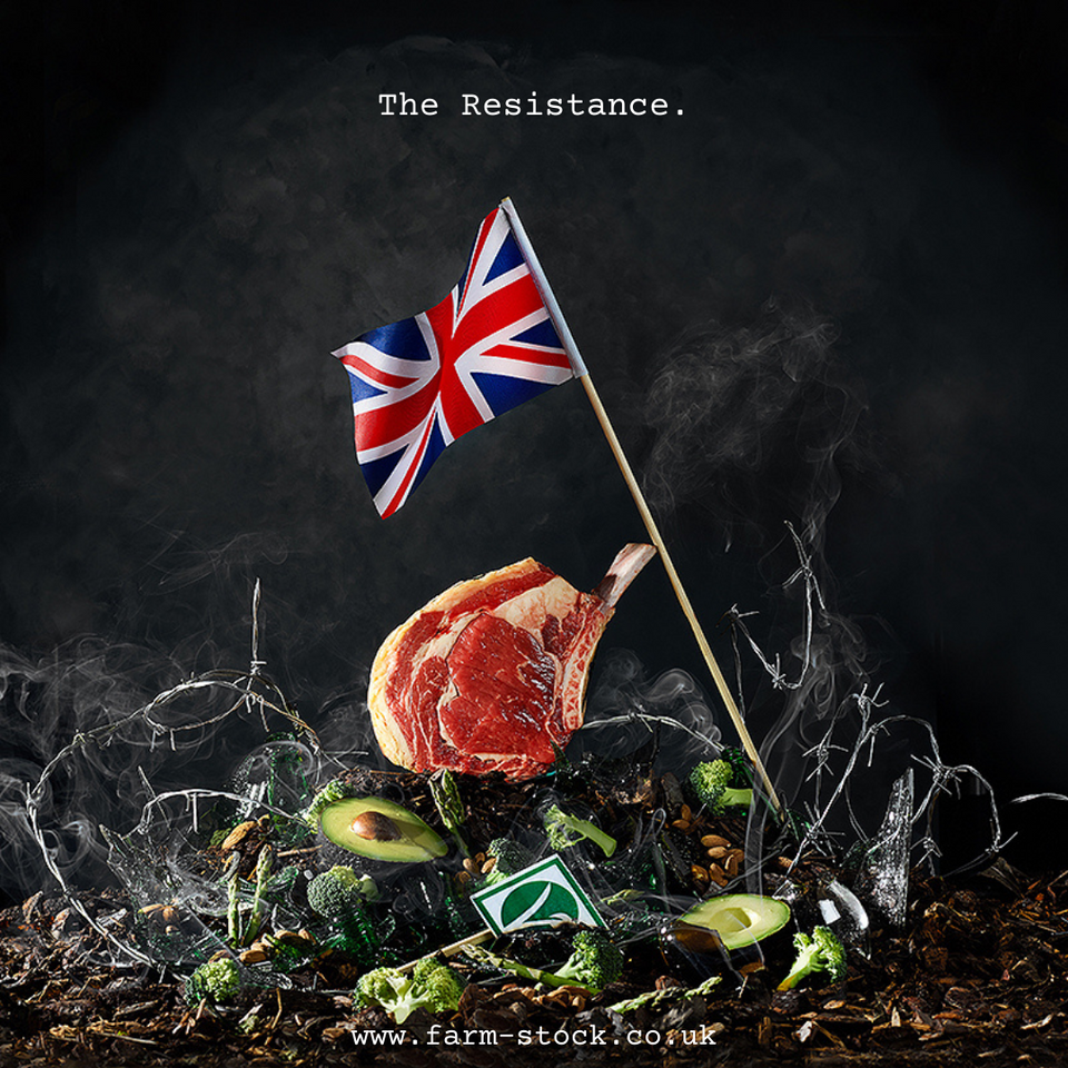
I've had a few questions about the image that is on the front page of the Farm Stock website. The one above, which is called 'The Resistance':
People asking what it is and how it was created.
The image was part of our 'anti-veganuary' campaign that we ran back in January 2021 on social media. As the name suggests, it was our attempt at opposing the whole veganuary movement as i don't believe it is a force for good - either for the planet or the farming industry.
The image depicts the victory of British meat over a smouldering pile of defeated vegan favourites including avocados and green veg!
Background
The inspiration for 'The Resistance' is a blend of the following two images. Firstly this one from Brewdog which I fucking love. It was from back in 2010/11 when Brewdog were only a couple of years old and were a proper gutsy start-up with exceptional marketing:
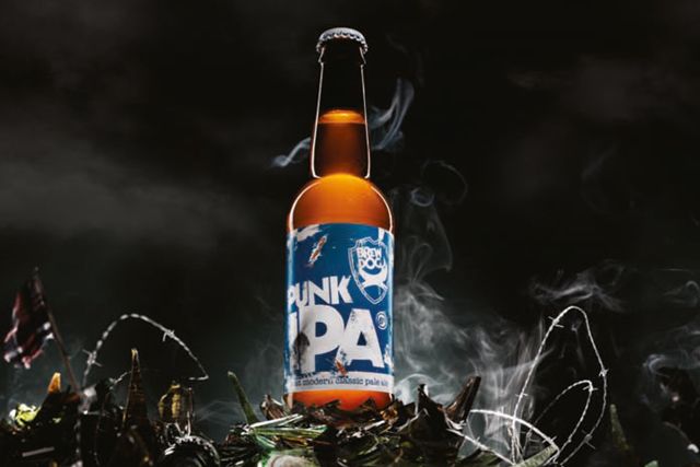
Their flagship product - Punk IPA - was the antidote to shit, bland, mass marketed lager and i think they fucking nailed the imagery with this one. It has to be one of my favourite campaigns Brewdog have ever produced.
The second image this is, of America solders raising the American flag on Iwo Jima in 1945 towards the end of WWII.
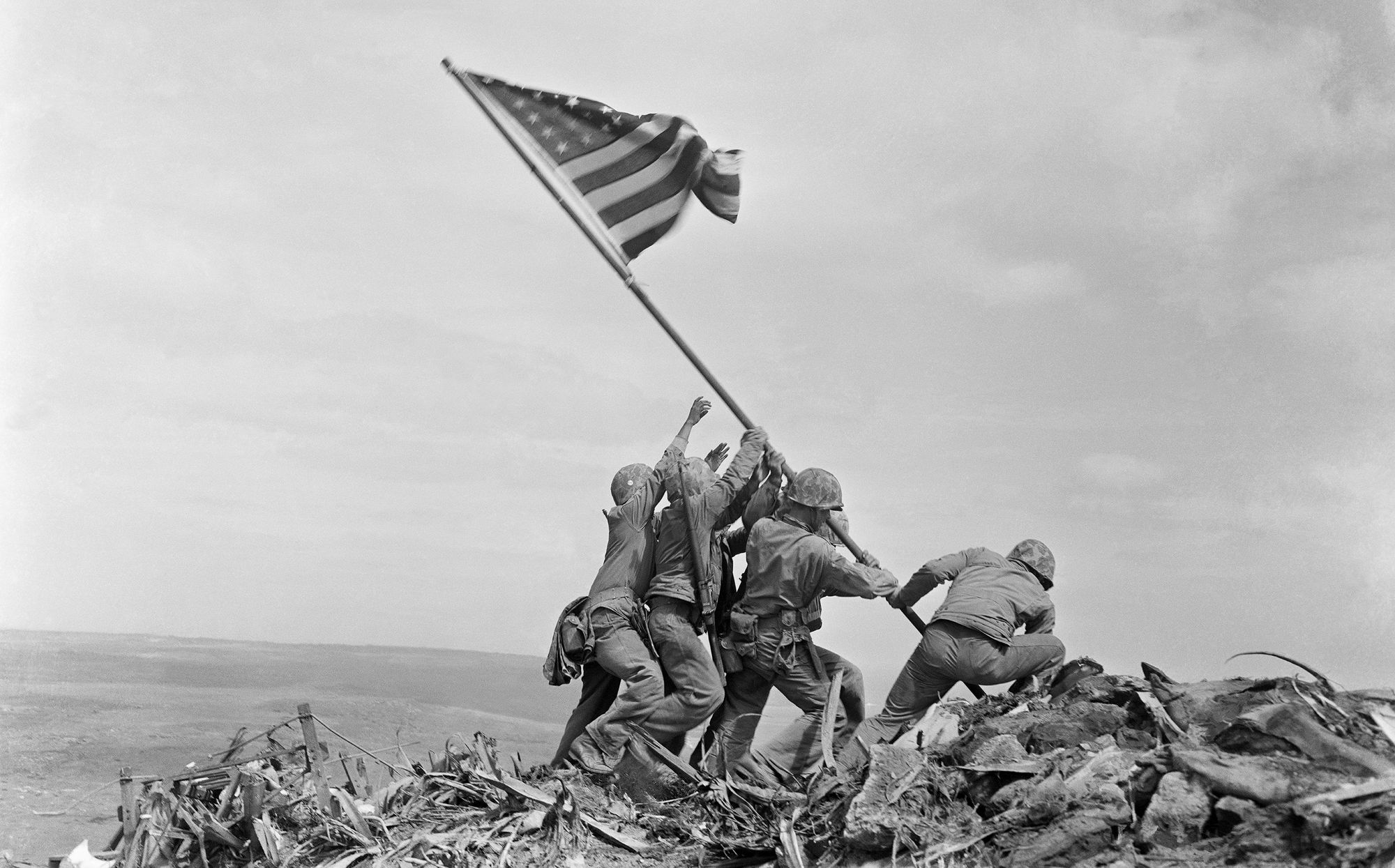
The image became one of the defining images of WWII and is a poignant symbol of the Allied victory over the Japanese.
I believe that farming, as an industry, is currently in a similar style battle against veganism, climate activists and the media who are wrongly portraying agriculture as the enemy in the fight against climate change.
'The Resistance' is my attempt at a symbol to demonstrate the fightback against such nonsense.
Creation
I approached a local photographer, Claudia Riccio, who specialises in food photography to create the image. Everything you see was created in situ and there was no photoshopping (apart from my hand which was holding the flag in place - to create the wave effect - and had to be edited out).
J & S Rook butchers supplied the French trimmed, rack of ribs (it was from an Aberdeen Angus) and was supplied fresh to give that really red, meaty look.
The mound was created using wood chips from the garden along with some barbed wire, broken glass and incense candles to create the smoke effect.
The photo was taken just before Christmas so we ate the beef on Christmas day itself and I can say it tasted as good as it looked!
The Result
Claudia did an amazing job and i really couldn't have hoped for a better outcome. I genuinely fucking love the image - i am slightly biased - so much so that i thought it would be the prefect one to use for the front page of the website.